The new colors of the year are out, and they are bold, poetic, and full of character. Rich, earthy deep tones and elegant grayish light colors dominate the new palette, fitting perfectly the moody interior trends we are about to see culminating in the near future. The sophisticated new colors that dictate the trends in the new year encourage us to embrace the atmosphere. The colors are perfect for envisioning ourselves in the autumn mist or being surrounded by the rustic warmth of clay-plastered walls. But don’t rush into thinking those colors lack the power to accompany your personality because this year’s selection has plenty of hues for all the elaborate tastes! And while Pantone is the most well-known company to dictate the trends in colors, there are several other popular companies to keep our spectrum broad and fresh. Let’s take a look at what’s new and radical in the color trends of 2023!
The New Vision
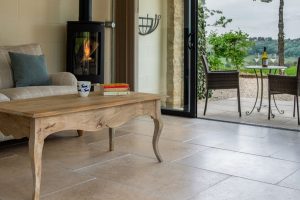
Colors set a home’s atmosphere, and the new palette for 2023 can bring radical changes to any interior. Be it an accent, a piece of furniture, or entire walls covered with them, the new colors bring so much character it’s hard to choose which one to use. Warm and earthy, dark and moody, light and breezy – many of them are so good you might feel the urge to repaint something in your home every month.
The new color tendencies have a sophisticated touch of nature in their approach, accentuating the importance of being connected to the roots. Many of the colors of the year 2023 emanate a calm, comforting, laid-back mood, while some are bold and stimulating in a refined way. Of course, there are a few not-so-successful ones in the packages, but I like to think of those as the necessary mistakes that come along with the creative process of visual trendsetters. Here is a selection from the new vision of the different paint companies:
Sherwin Williams’s Earthy Palette
The color of the year 2023 at Sherwin Williams is Redend point, a creamy, mid-tone clay color with powdery pink notes. While it’s a nice warm color, it might be slightly too warm and powdery, making the room’s atmosphere saturated. The rest of their color selection is also extremely earthy, and, given the rich, oily character, these colors look best on wooden furniture pieces and possibly wooden paneling. A beautiful highlight of their selection is Urbane bronze, an absolutely gorgeous, dark, moody wall color. The greenish tint truly has a metal effect, making this color warm and cold at the same time.
Benjamin Moore’s remorseless sincerity
This year’s colors at Benjamin Moore are extremely courageous, open, and optimistic. Their choice of the color of the year is also a warm mid-tone color but on the more saturated side of the spectrum. The color is vibrant and evokes joy and energy while wrapping us in velvety coral enthusiasm. Raspberry blush is simply brilliant, the perfect orangey hue to accompany Pantone’s Viva Magenta.
Two more highlights from their palette: Wenge – everyone’s favorite. An amazing, bold dark brown color, Wenge is almost black, with a discreet tint of purple. It can work elegantly as an accent wall. Their Starry Night Blue is a sophisticated hue of dark blue, which has the properties of being dark and airily radiant at the same time. It’s an absolute must-have in a bedroom.
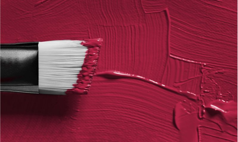
Refined and Upfront Viva Magenta from Pantone
On Pantone’s page, Viva Magenta, their new color of the year is defined as one inspired by nature, sending our spirits back to something primordial. Contemporary yet archaic, Viva Magenta is a strong color, a real personality, that invites us to find our connection with something inside us. It’s an invitation to rediscover our inner strength and be fearless about personal truth.
The color was inspired by the red of the cochineal, which is one of the most valuable natural dyes.
As a color with such a character, it fits perfectly for accent furniture pieces and accessories, but it even works as a wall color.
Behr’s Zen Blank Canvas
The new color of the year 2023 at Behr brings precisely what its name promises. A blank canvas is a beautiful broken white tone, similar to eggshells’ color. This warm, natural white is an excellent base, truly a blank canvas inviting us to experiment with highlights or stay meditative in neutral. This color stands out with its necessary discretion and silent mindfulness. It is the perfect base to help the flow of creativity. The other hues in Behr’s selection are also on the light side of the spectrum. The soft grayish pastels are a nice counterpart to the vivid palette of the other companies. Behr took a different approach from all the others, which is also a brave move. Still, Blank Canvas can easily be harmonized with many colors on the spectrum of the new year’s tendencies, representing a friendly voice that’s easy to welcome.
Spanish Moss by Krylon
Taking “nature-inspired” the furthest in their approach, the company Krylon chose a deep, saturated dark green as their representative color for 2023. Spanish Moss is, as its name makes it evident, a moss color that reminds us of deep forest floors and clean, ozone-rich air. The color is comforting and calming in its organic, dark way. It makes a perfect match with the other earthy tones throughout the market. This color best accentuates furniture pieces and decor objects and can work wonderfully as a rich curtain or cover color.
To conclude,
The new colors of the year 2023 offer us plenty of space to explore our creativity with combinations. Experimentation with highlights, accents, base colors and textures has many possible combinations to look forward to. We can confidently say that the new colors of the year are nothing but conventional, and they invite us to shape our homes in the likeness of our own personalities and be unapologetic about them. Dark, moody spaces invite us to explore a poetic side, while the light, neutral, and earth tones create a calm and soothing space for us. The vivid, rich hues of red and dark greens connect us with the force and exploding beauty of nature. Even the hues of neutral colors communicate something, and we are invited to accept the invitation and expand our interior worlds outward in a classy and refined way. Nothing is more radical than staying true to what we believe in. These colors are meant to surface and enhance those feelings, by connecting us back and grounding us in our original way of being.