
Working with bulks of data can be tricky, and that’s why you need a way out of those boring sets of data. For example, let’s say you are a business manager looking forward to presenting a new product idea to your stakeholders, and you have sets of data to back up your plans. It will be challenging to expect your stakeholders to understand what you have put together through bulks of data. Why not use data visualization to get them to understand your point of view?
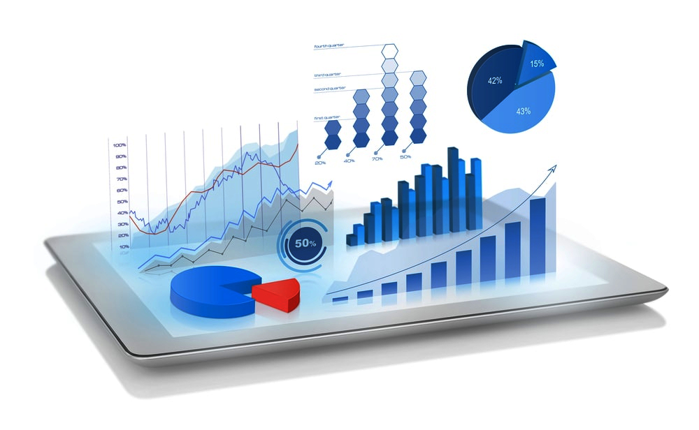
Data visualization in the form of charts, plots, pictures, diagrams, maps, and graphs, gives you an edge in better explaining your point of view to an audience. Come to think of it, man is a visual being, and we tend more to connect to shapes, colors, or maps, depending on what you’ve decided to present.
Data is like the Sankey diagram is your best bet when dealing with this kind of situation. It saves time and stress and helps you make better data-driven decisions. Therefore, we want to find out in this blog the science behind data visualization to enhance your understanding.
Is Data Visualization an art or a science?
The question of whether data visualization is an art or science has been bothering the minds of several people. While we can categorize visualizations as art considering that visualization has to do with art, i.e., something that can be seen and interpreted, we cannot take away its aspect of science that deals with data analysis.
The science deeply involved in visualization means that you have to get the data set and analysis right to get the correct information. Thus, visualization is simply both an art and a science.
The art aspect of visualization ensures that charts, maps, graphs, pictures, and diagrams can communicate deeply. Imagine drawing a bar chart without being able to pinpoint what it means. The fact that you can deduce information from data visualization makes it an art, and that’s why it is called “visualization.”
Application of Data Visualization
As a Data Analyst, you have to keep in mind that the science of visualization will take us to the application of data visualization. The purpose of this aspect is to make sure people with little or no knowledge of data science can derive something meaningful from their sets of data. It means no matter your field; you can use charts & graphs to represent your data and communicate to your audience without any challenge. Let’s check below for some of the ways you can apply interactive visualization;
- Data Checking and Cleaning: If you want to check for errors in your data set, visualization will help you find out where the errors are. This includes character encoding, string, the sensibility of spatial data, the format of dates, distinct records, random values, and nulls. A Sankey diagram is one of the charts you can use to discover errors in sets of data.
- Distribution of Data: Another thing you can use visualization to do is to use it to have an understanding of data distribution. You can find out the mean, median, and mode of a data set through visualization. You can also find out the presence of outliers through a boxplot.
- Assumptions through Models: Different models like linear regression and correlation can be validated through data visualization. You can also use visualizations to find out the homoscedasticity of error terms.
Types of Analytical Sets of Data
Before you can determine the type of visualization you want, you have first to understand the types of data sets you have. If you’re going to draw a Sankey diagram, you have to ensure your data indicates a flow of the sequence. If you are using a Likert Scale, the visualization you will get will be entirely different after data analysis. Below are some of the datasets you can have;
- Textual Data: When you have a flow of words or punctuations, you can find them in customer complaints or Twitter feeds. It shows that you may have to give each parameter’s name before proceeding with visualization. A 5-point Likert Scale can also be found in this category.
- Spatial Data: We usually use this set of data in drawing maps. It deals with organized data used in locations, longitude, latitude, or geographical information about an area or city.
- Tabular Data: If you want to draw bar graphs, line charts, or Sankey diagrams, you may need to have your data in a tabular form to have a brilliant visualization. These data are usually organized in rows and columns within a table. Examples are seen in Pandas data frame, CSV files, Excel files, and several others.
Conclusion
While we can consider visualization as an art, it is also much of science. The data analysis process means that if the science behind a set of data is not properly done, the type of diagram or graph you will get will contain a series of errors.
The advantage of using visualization is that you don’t even need to know data science before you can enjoy it. Everything is automated, and you only need to understand how to correctly key in your data and interpret the set of information displayed.